✦ Back to Homepage


Redesigning linear onboarding into interactive exploration
My Roles:
UX Designer
Team:
PM, Designer, and Engineering
Year:
2025
Context
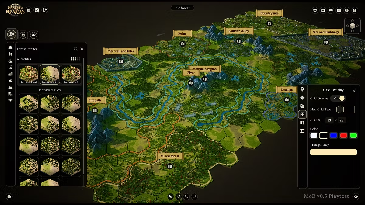
I redesigned the onboarding tutorial to help map creators understand the tools and adopt the workflow faster.
Problem
After reviewing user feedback and doing additional research, our tutorial is too long, causing fatigue and churn. Users were forced to follow the tutorial sequence, which was not enjoyable and took more than 7 minutes to finish.
Action
We need to create a concise and streamlined alternative onboarding flow.
How might we incorporate a tutorial flow that encourages users to naturally discover and experiment with the application?
Solutions
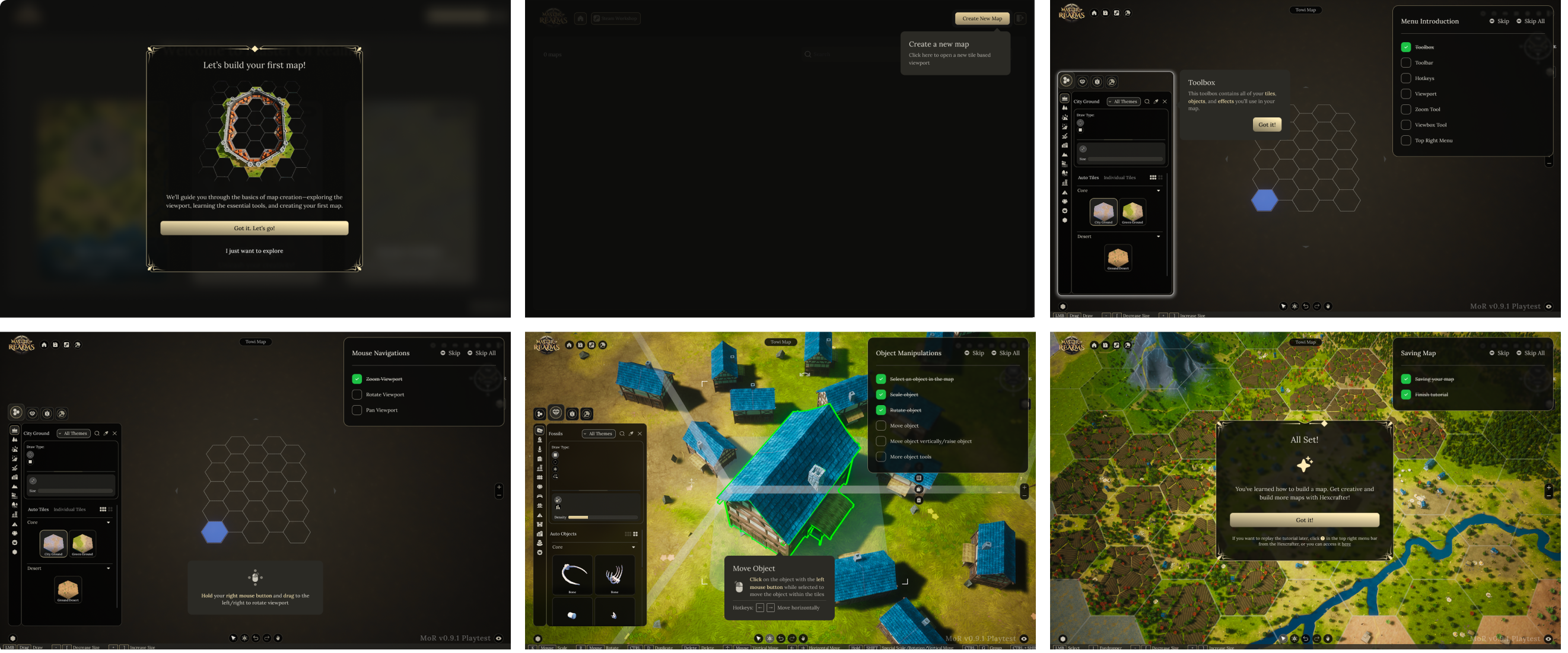
Tutorial steps should appear only within specific tools where guidance is actually needed. It must be minimal, easy to understand, and focused solely on helping the user complete that action quickly
Cutting the unnecessary
Let user free to explore and experiments without restrictions instead of forced to follow step by step tutorial.
Introduce contextual tutorial
Show only relevant tutorial (with short video clips) only when user access specific tools and areas.
Revisit the tutorial
When user finish with all of the tutorials, let them know that they can replay them all from the Helps menu.
Final Design
Show contextual short clip describing how to use the tools and mouse interactions.
⌛️ Please wait for a moment if the video preview won’t playing....
User free to experiment with the tools, and only trigger the contextual tutorial popup when they access a specific tool.
When all tutorials are completed, let user know that they can revisit them again via the Helps menu.
I’l be happy to walk you through the case study behind this project
I am available for an online conversation at your convenience to explore potential roles and how I can add value to your organization.


✦ Back to Homepage
Redesigning linear onboarding into interactive exploration
My Roles:
UX Designer
Team:
PM, Designer, and Engineering
Year:
2025
Context
I redesigned the onboarding tutorial to help map creators understand the tools and adopt the workflow faster.
Problem
After reviewing user feedback and doing additional research, our tutorial is too long, causing fatigue and churn. Users were forced to follow the tutorial sequence, which was not enjoyable and took more than 7 minutes to finish.
Action
We need to create a concise and streamlined alternative onboarding flow.
How might we incorporate a tutorial flow that encourages users to naturally discover and experiment with the application?
Solutions
Tutorial steps should appear only within specific tools where guidance is actually needed. It must be minimal, easy to understand, and focused solely on helping the user complete that action quickly
Cutting the unnecessary
Let user free to explore and experiments without restrictions instead of forced to follow step by step tutorial.
Introduce contextual tutorial
Show only relevant tutorial (with short video clips) only when user access specific tools and areas.
Revisit the tutorial
When user finish with all of the tutorials, let them know that they can replay them all from the Helps menu.
Final Design
Show contextual short clip describing how to use the tools and mouse interactions.
⌛️ Please wait for a moment if the video preview won’t playing....
User free to experiment with the tools, and only trigger the contextual tutorial popup when they access a specific tool.
When all tutorials are completed, let user know that they can revisit them again via the Helps menu.
I’l be happy to walk you through the case study behind this project
I am available for an online conversation at your convenience to explore potential roles and how I can add value to your organization.